Brand refresh
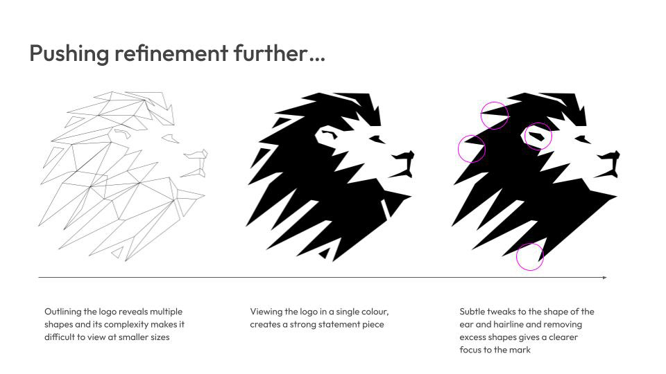
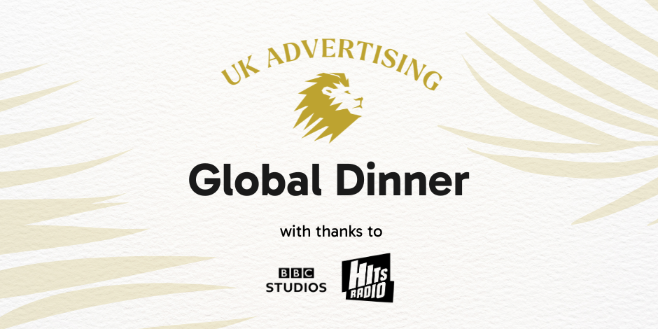
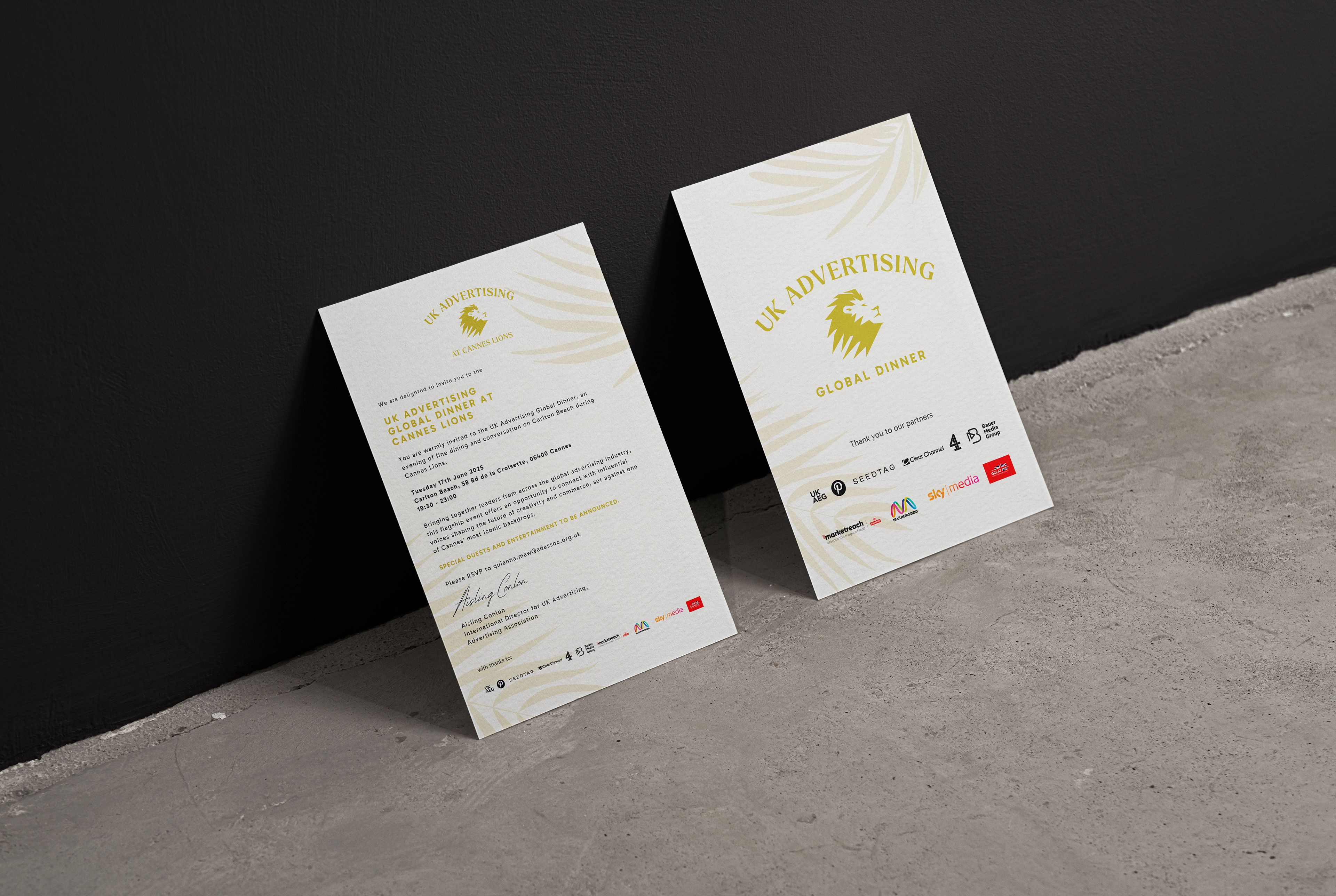
The UK is home to some of the most awarded, effective, and influential advertising in the world. UK Advertising felt their current branding didn't reflect the premium nature of their presence at Cannes Lions. By introducing a modern serif font and simplifying the iconic Lion as well as creating a more defined hierarchy of information we create more of a statement and a presence for the brand at Cannes. To expand the visual identity we introduce a palm leaf graphic as a nod to the location as well as bring depth to the identity.
Design/Art Direction